Overview:
Kikout is an urban streetwear label co-founded with the vision of blending anime culture, street aesthetics, and bold self-expression into a contemporary clothing brand. The objective was to create a distinctive identity system that resonates with young, trend-driven audiences while maintaining scalability across digital and physical touchpoints.
The core challenge was to design a brand identity that feels energetic, expressive, and culturally relevant without becoming visually cluttered. The system needed to function seamlessly across apparel prints, packaging, social media, retail signage, and merchandise.
Brand Concept
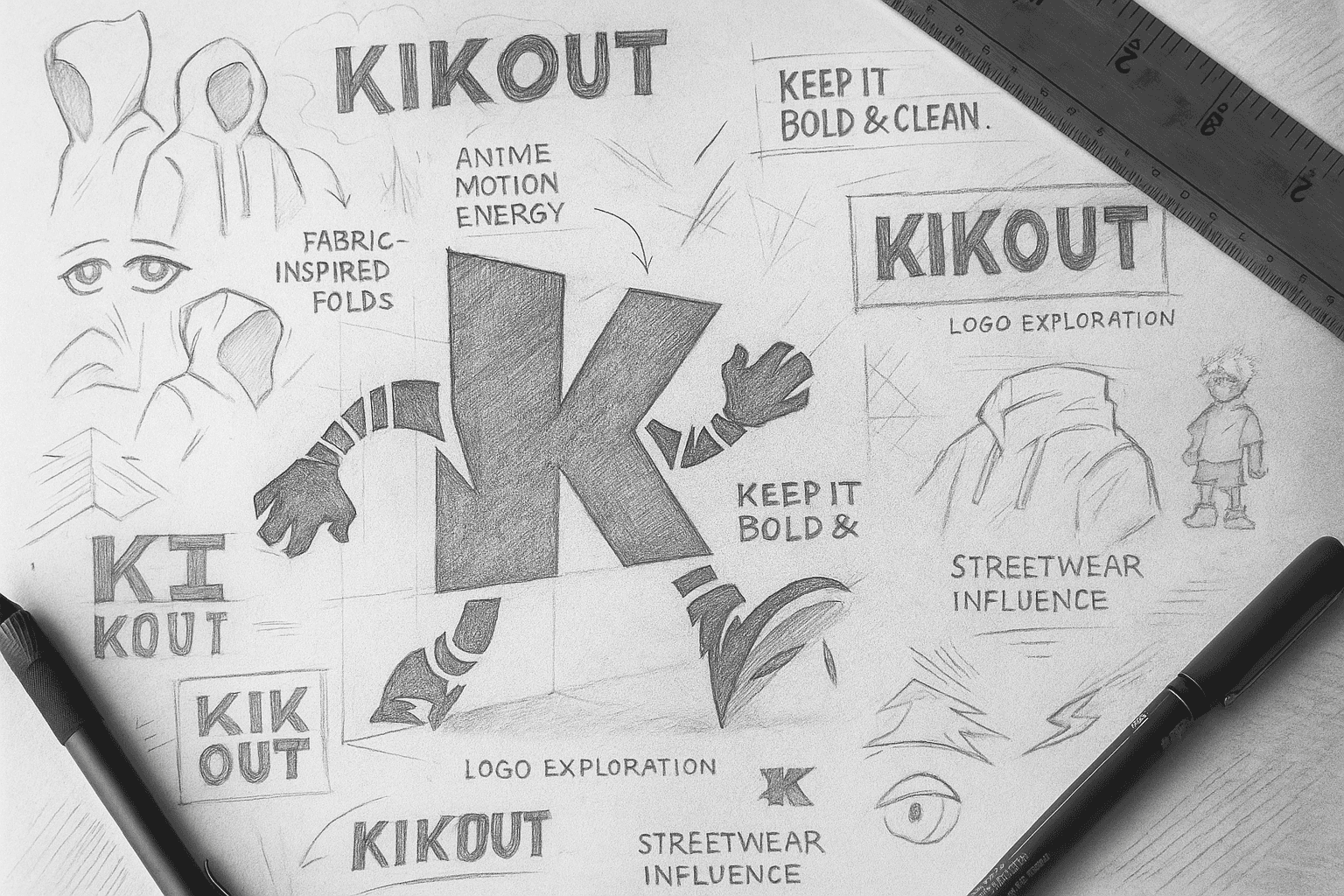
The identity is built around the idea of motion, attitude, and individuality.
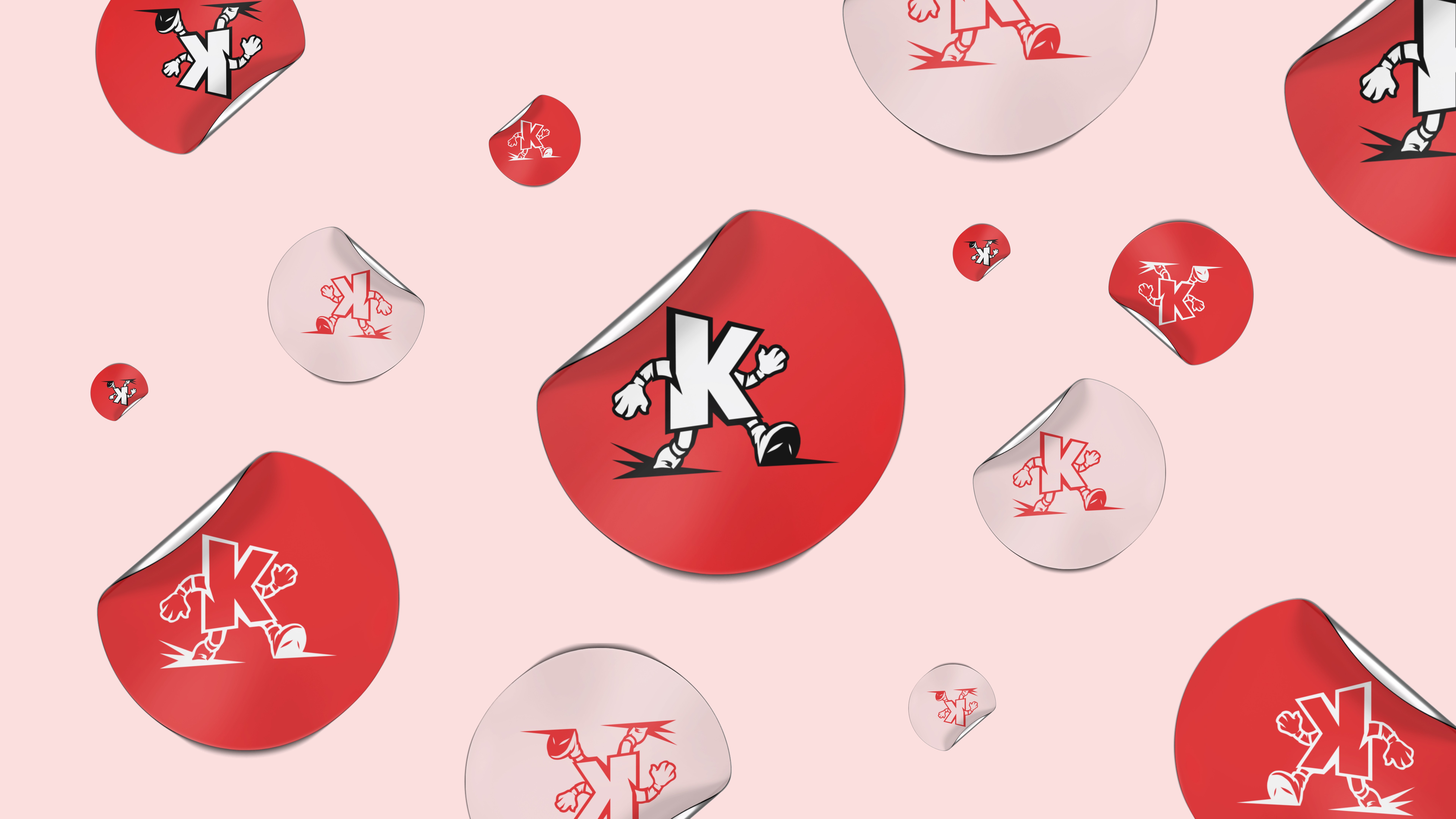
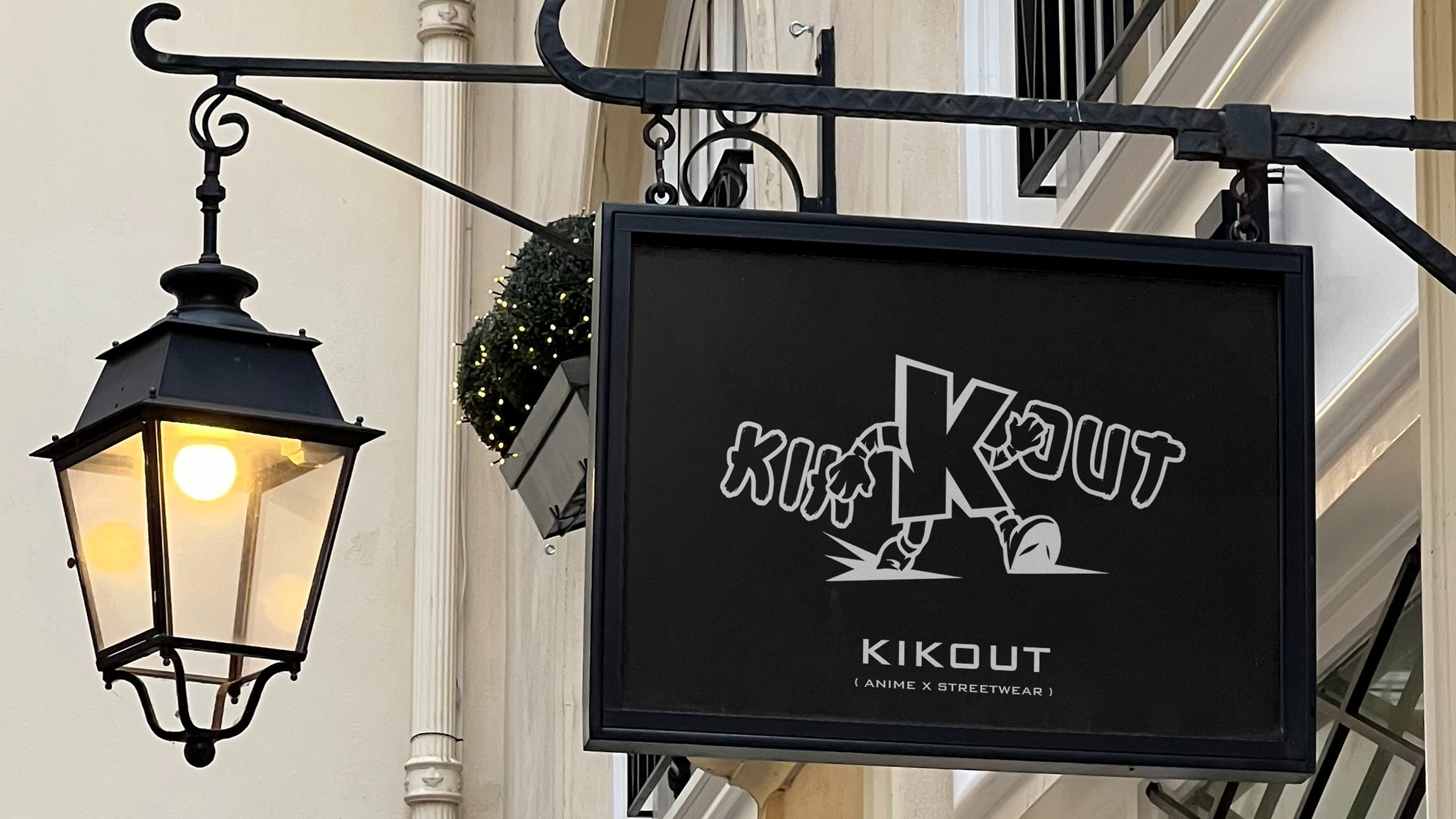
The central visual element, a dynamic anthropomorphic “K” symbolizes movement and confidence. The walking stance reinforces momentum and forward-thinking culture, aligning with streetwear’s connection to youth energy and rebellion.
The design language draws influence from:
Anime-inspired dynamism
Urban street culture
Bold graphic minimalism
High-contrast visual storytelling
Visual Identity System
Logo Design
Custom character-based logomark (Anthropomorphic “K”)
Bold, high-contrast structure
Adaptable for mono, duotone, and pattern applications
Color Strategy
Primary: Red (energy, boldness, youth culture)
Secondary: Black & White (contrast, clarity, versatility)
Neutral tone variants for flexible background applications
Typography
Clean, strong sans-serif for clarity and adaptability
Minimal styling to maintain focus on the character mark
Applications
The identity system was designed to be modular and scalable. It has been applied across:
Apparel graphics
Pattern systems for fabric and packaging
Business cards & brand collateral
Retail signage mockups
Stickers and merchandise
Social media branding
The repeating “K” pattern establishes brand recall while allowing creative experimentation across surfaces.